
Responsive Website Design & Development
Responsive WordPress web design presents your website beautifully across multiple devices like smartphones, tablets, laptops, and desktops. With our help, your website will:
- Be user friendly on multiple devices (recommended by Google).
- Make a great first impression with each of your potential customers.
- Communicate effectively with your target audience.
Want to be our next Happy Client? Please call (612) 590-8080.

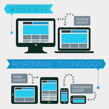
What is responsive website design?
A responsive website is a single website designed to adapt to the various devices used to access the site, including desktops, laptops, tablets, and smartphones. A responsive website design will automatically resize your website’s dimensions, content, and graphics to make it universally user friendly.
Why should I use a responsive website?
Responsive websites make it easier for search engines to understand your focus and provide your content to the searchers. Google also announced its importance. This search-engines-friendly approach, combined with a user-friendly presentation, means customers will find you more easily and spend more time on your site.
Mobile usage is now the norm. Any website not designed to be mobile-friendly will frustrate visitors who try to view the website on their mobile devices. You will lose these irritated customers as they turn to mobile-friendly competitors instead. Our professionally-responsive website design means you’ll maximize your audience by reaching both desktop and mobile users, all the time, every time.
Responsive website design can help you cut costs by combining both desktop and mobile websites into one site rather than designing the same website twice to be compatible for both desktop and mobile visitors.
Customers are using their mobile devices to access the Internet more than ever. In order to attract, convert and retain new customers, your business needs a website that is attractive and user-friendly on all devices. Below are the best practices we use to build effective websites for our clients. To get your web website done right, contact our Minnesota web design company today at (612) 590-8080.