
A Nonprofit Website Redesign Turns Browsers into Believers
HCA-MN came to us with a powerful mission to advance the Minnesota Health Plan. The issue wasn’t their aspirations, it was their website that worked more like a 1990s link directory than a
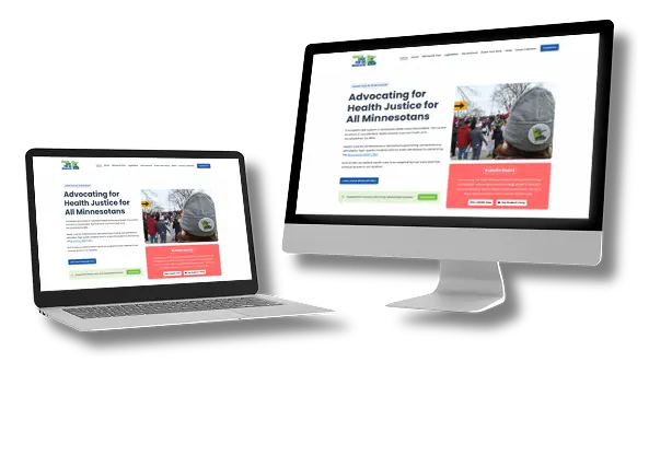
modern advocacy hub. Visitors arrived, saw a sparse list of buttons, and left without ever grasping the cause. We rebuilt the homepage from the ground up, transforming it into one explaining the problem, presenting the solution, and highlighting legislation. All this and more while driving visitors to donate, subscribe, advocate, and share, all before a single extra click.
What We Did at a Glance
Replaced a sparse link-directory homepage with a full narrative advocacy experience
Architected conversion paths for donors, volunteers, subscribers, advocates, story-sharers, and event attendees
Rebuilt the navigation menu around user intent, not internal silos
Published fresher content signals through newsletters, legislation pages, and events into 2026
The Challenge
A Strong Mission Had a Split Digital Experience.
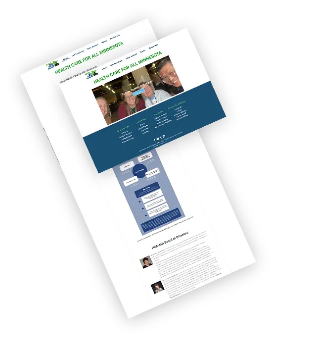
HCA-MN had the content. They had the cause. What they lacked was a homepage doing justice to either. The legacy site opened with a sparse brand block and four utility buttons, then sorted everything else into grouped lists. That kind of layout can serve returning supporters who already know where to go, but it consistently fails first-time visitors needing context, trust, and a clear next step before they will commit. Meanwhile, parts of the wider site still showed 2021 footer dates and an outdated menu, signaling to visitors and search engines alike that the organization might be less active than it truly is.
What Was Holding Them Back
Weak Homepage Story: The old homepage offered links but no narrative. Visitors had to navigate before the site had earned their attention or trust.
Siloed Navigation: Broad menu buckets (About, Get Involved, Take Action, Resources) gave visitors few signals about where each click would take them.
Scattered Conversion Paths: The only clear calls to action were donate and subscribe. Opportunities to advocate, attend, volunteer, host a speaker, or share a story were buried.
Accessibility Gaps: Many homepage images were exposed as generic labels like “image” and “slide” creating barriers for screen-reader users.
Incomplete Migration: Old-style pages, footer dates from 2021, and the legacy menu were still live on the same domain, undermining the new design’s credibility.
SEO Signals Misaligned: Search results still surfaced the older title and homepage snippet. Canonicals, redirects, and sitemap coverage had not yet been fully resolved.
Our Strategy
We Didn’t Only Redesign a Website,
We Rebuilt Their Digital Foundation
Every decision was driven by their three goals of clarity, trust, and conversion. A visitor who doesn’t quickly understand who HCA-MN is and why the Minnesota Health Plan matters will never become a
donor, volunteer, or advocate. So before touching a single design element, we mapped the complete
user journey from cold arrival to committed action.
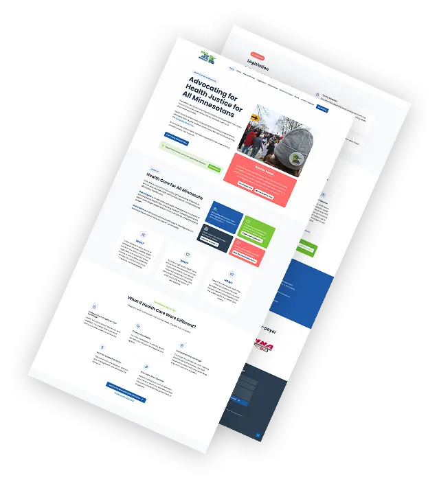
1. Information Architecture: Navigate by Intent, Not Internal Logic
The previous menu organized content the way staff thought about it internally. The modernized version organizes it the way a first-time visitor searches for it.
Old menu: About, Get Involved, Take Action!, News, Resources
New menu: MN Health Plan, Legislation, Share Your Story, Events Calendar
Why it matters: Visitors can now predict exactly where each path leads before they click, which reduces friction and increases confidence.
2. Homepage Content Structure: Teach and Persuade on the Page
On the legacy site, learning required clicking. On the redesigned homepage, the page itself carries the full story without asking for commitment first.
Above the fold: Who HCA-MN is and what the Minnesota Health Plan proposes
Middle sections: Why the issue matters, how legislation connects, and what success looks like
Conversion layer: Donate, subscribe, attend an event, contact an elected official, volunteer, host a speaker, or share a personal story
Result: Seven distinct user flows now exist on a single page, compared to two on the prior version
Results
A Clearer Path from Awareness to Action.
The redesigned homepage now addresses three questions in the first scroll, being, who HCA-MN is, what it wants to change, and what you can do right now. The legacy homepage offered two conversion actions, donate and subscribe. The new homepage offers seven, arranged in a logical flow from awareness to commitment.
Before & After: Homepage Conversion Paths
Legacy homepage:
Donate · Subscribe · Events · Request a Speaker · Grouped Links
Redesigned homepage:
Donate · Subscribe · Attend an Event · Contact an Elected Official · Volunteer · Host a Speaker · Share Your Story
KPIs to Track Post-Launch
Donation click-through rate from homepage hero and footer CTA
Newsletter subscribe conversion rate (form completions ÷ unique visitors)
Event calendar click-through rate and RSVP volume
Share Your Story form starts vs. completions
Contact form completion rate
Organic visits to the Legislation and Minnesota Health Plan pages
Page speed scores on mobile after visual content is fully loaded
What This Client Said About ProWeb365
Why ProWeb365
Every decision was driven by three goals: performance, clarity, and discoverability, across both traditional search engines and next–gen AI-powered platforms.
Websites Built to Explain, Guide, and Convert.
This HCA-MN project is a clear example of how ProWeb365 treats website redesign as strategy, not decoration. We began with the question every nonprofit homepage must answer, “Does a first-time visitor immediately understand who you are, why it matters, and what to do next?” When the answer is no, the design is the symptom, and we go after the root cause.
For our client, that meant rethinking the full information architecture, restructuring the homepage narrative, upgrading the technical stack, and documenting the accessibility and SEO work still needed to reach full performance. The result is a homepage that now earns trust before it asks for action, and a clear roadmap for getting the rest of the domain there too.
What We Deliver for Nonprofits and Advocacy Organizations
Clear Narrative: Homepage messaging explaining the mission and earns trust before asking for a donation or sign-up
Intent-Based Architecture: Navigation and page structure built around how supporters actually think and search , not how staff organizes internally
Full-Funnel Conversion: Multiple conversion paths for donors, volunteers, subscribers, advocates, event attendees, and storytellers
Ready to Turn Your Website into Your Best Advocate?
Your cause deserves a homepage that does it justice.
Let’s talk.